
This will be a self portrait but I am going to try and do something a bit different. I will try some unusual angles, or maybe to put something in the picture with me…my cat, maybe? I was thinking of Frida Khalo with the monkey and a cat. I don’t think the cat will pose with me so I will have to add him in separately….
source:http://www.fridakahlo.org/self-portrait-with-thorn-necklace-and-hummingbird.jsp
Also, I was recently looking at the work of photographer Florá Borsi (online) and her ‘Animeyed’ self portraits.  source: http://www.floraborsi.com/animeyed-self-portraits
The important key in the photos is that the eye pupils align up. This is what makes them work so well. So I am thinking about borrowing from this idea but obviously I will be painting and not photo-manipulating.
As far as a background is concerned, I think for a portrait it can be plain in order to put the focus on the person, or it must complement in someway – or be relevant and not too cluttered. In the Khalo, the green leaves work well with the picture as a whole, as it is all very organic with the necklace and the hummingbird and the butterfly/dragonflies.
I tried out a pencil sketch:
I think the idea will work, that cat’s eye needs to be right in the right place, it is not quite right but nearly. I found a good picture of Sabi that I had taken, of him and the full moon, he is just at the right angle so I will be able to work from that and of course, get his fur colour from real life. 
I need to think about the background. I can drape a curtain or blanket over a screen behind me to work. I am wondering about an animal print… I have a towel that is green with zebra type stripes and also a blanket with big cat markings.
I tried both:


Perhaps they are both too distracting, Looking at famous self portraits, the backgrounds do tend to be fairly plain…. https://www.theguardian.com/artanddesign/jonathanjonesblog/2014/sep/04/the-top-10-self-portraits-in-art-lucian-freud-sherman-rembrandt
I do like the green but now I remember that I used green for the background for assignment 2 so maybe not again. Sabi’s fur and my blonde hair will stand out enough and I want the eyes to be the main feature. I might try a plain red. I have a plain red sarong I can use. My eye and the cat’s eye will be green so the red will make that jump out. In fashion, I also like red with animal print! So the cat fur will look good with the red behind, I think. I need to try painting the cat fur and also flesh tones next.
I have been looking online at the work of a local (Gibraltar) artist, Estelle Day. Her superb portrait ‘Robert’ has been selected for the BP portrait award exhibition. I note her subtle rendering of the skin tones and the subtle use of shade, which is what I hope to achieve this time. Image taken from: facebook: https://www.facebook.com/estelledayfineart/
I have been trying out the cat’s fur today. In life, he is sandier than in the picture. I have mixed raw sienna and naples yellow and some white to give a sandy base. I then used white for the light areas and black mixed with white for the stripes and speckles. Using white dryish on top of the black gives a good effect. And the red looks good next to the fur. I think now that the eye is not quite at the right angle, I need to have the head turned towards the viewer slightly because a cats eye is a flat disc really. I will do some more sketches and work it out. Skin tones next. 
I painted an A4 sheet with the red and let it dry. I then sketched my face (actually it doesn’t look anything like me…but just trying out tones) from the mirror, and tried various colours over. I quickly realised that I need to paint it in white first, then paint on top of that as the red shows through. This may not happen so much on the canvas however. I am trying not to have such exaggerated shadows as the last one I did of myself, which was not flattering… Titian bluff is my best friend when it comes to my skin tones and hair….More light on the face seems to work. It won’t be so exagerated as this, I want to get more subtle this time.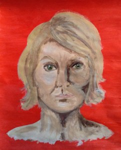

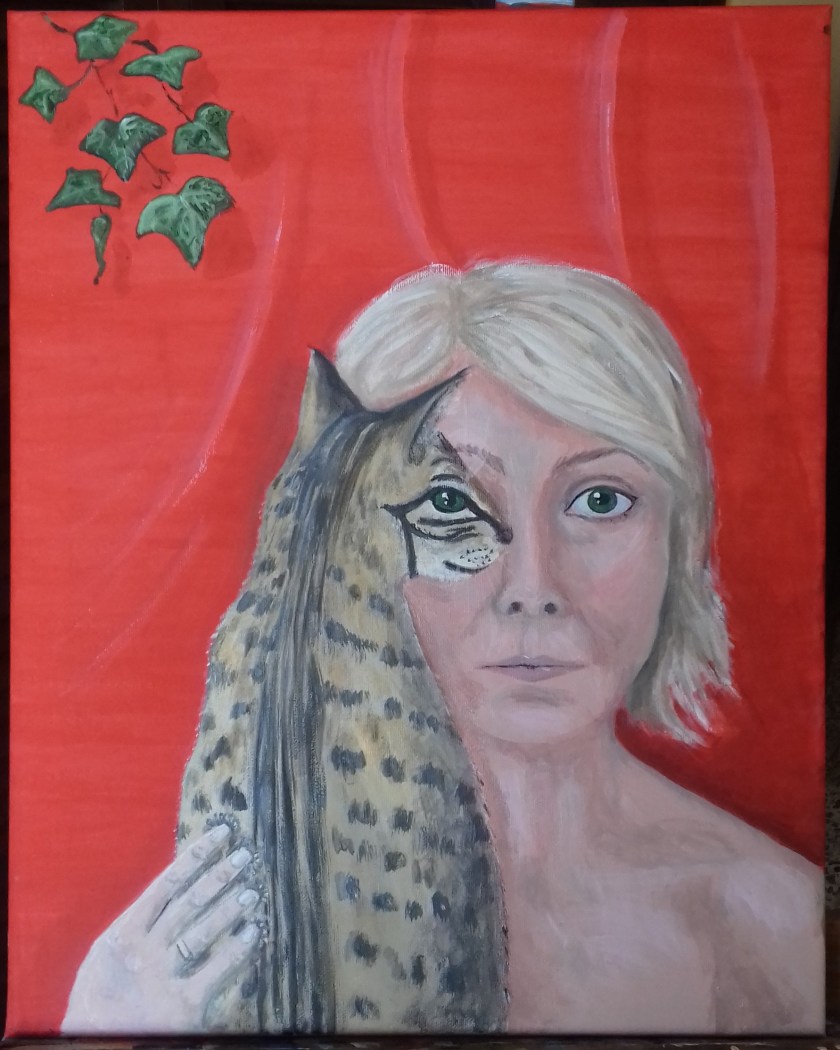
I have painted my face and hair roughly onto the canvas and worked out the cat – lining up the eye was very hard and I was beginning to regret my choice but then suddenly it seemed to work. I think now though that the cat body looks as if it is the other way around, as in he has his back to the viewer, so I have been trying to get my cat into position to sketch and photograph this angle..not easy -) I have also put my hand in holding the cat as I think this balances the picture out better. I am also thinking of putting something in the top left corner, a plant or maybe a butterfly as I also think this will balance the composition better. 

")
")
I am sure I should have worked this out beforehand but actually working on a between A3 – A2 board it is hard to visualise. Now I can step back from it and look with fresh eyes and see what is needed. Enough today.


Today I have been painting for about 3 hours. I think I have almost finished. I am pleased with the cat fur and the eyes line up well. Sabi’s eye is also my eye. Of course, my eyes are a green/blue and his are gooseberry green but my artist license allows me to make them the same 🙂 The ivy (it’s fake and plastic but moveable!) balances the composition out well I think. Going to leave it over night and see if I need to change or tidy anything tomorrow, with fresh eyes. Then I hope I can send this assignment off on Monday which should meet my deadline 🙂
So today I just tided up under the eye and and the hand. I think I am finished now and don’t want t mess with it any more. I am pleased that the eye lining up worked and I think this gives it a different twist. I like the bold red backdrop, I think this worked well, although red is a hard colour to paint on top and I had to use white alot on top as a base. Husband and sister think I have caught my likeness; I think I have but I am in a more flattering light (which is what I wanted anyway…) I think the skin tones are better than I have produced before. A delicate touch is needed for them I think.
Updated: response from tutor feedback:
‘Your chosen palette red and green (ivy) have associations with christmas. This can interrupt other symbolic interpretations The red is a little harsh / loud / obvious choice sitting against the softer qualities of hair, skin and cat fur. Was this intentional and for what purpose? If not how could you alter the ‘background’ to shift the mood or psychological tone of the painting? If you were to paint this again, how might you approach it differently…. to convey what particular symbolism, ideas, mood or psychological tone etc .
The choice of a cat (your pet) and the piece of ivy dangling in front of the deep red sarong. Whilst there are obvious references to Kahlo. I wonder what your intentions were in conveying ideas or content of a personal nature. This isn’t commented upon in your critical reflection or on your process. Post your thoughts on these questions to your blog .’
I did not associate the red and green in any way with Christmas, and feel this is subjective. I see the red as strong, vibrant, exciting, bold – and a good contrast to the skin tones, fur and hair. I also used the red as a complementary colour to make the green eyes, which are the focal point of this work, stand out. I had decided, after my demonstrated experimentation, on a plain backdrop. I am happy with the outcome and would not wish to change the red, although I had also considered a strong green but rejected it on the grounds that my previous assignment had a green background. Had I used green, it would also have been bold and strong; then I would have put in some red flowers, perhaps, to complement. The alignment of the eyes symbolises my closeness to the cat and my constant trying to see the world through his eyes and also that we are all sentient beings viewing and living in this world together. Although I had explored the idea of my head in profile being more interesting, it would not have worked to use it in this case as the main focus was the alignment of the eyes. Although the cat was a feral born, his marking are that of an Egyptian Mao, and I am pleased to have shown his markings and nobleness thus. I have bared my shoulders in several self portraits; this is so as to show myself as I really am – laying myself bare so to speak, … without being judged for my sartorial choices (also gives a larger area to explore skin tone). I also remove all jewellery for this reason, except my wedding ring.

